MOMKIT APPLICATION
User Research, Interaction Design, User Testing
Client: LiquidGoldConcept
Project type: Team project
Duration: Sept 2016 - Dec 2016
Introduction
MomKit is a mobile health app that teaches parents evidence-based breastfeeding techniques with Pixar-style animations. With MomKit, mothers can learn how to alleviate, improve, or prevent the most common breastfeeding problems.
Role and Responsibilities
I led a team of 4 designers to work on the Momkit application for our client. My responsibilities included managing client communication, handling the contract, designing a plan for the design process and making sure my teammates learn from this project experience. The most important aspect of this project was that we used a user-centered process to design and test the prototype. The value we brought through our process was to validate the features provided by the application and test new functionality.
TARGET USERS
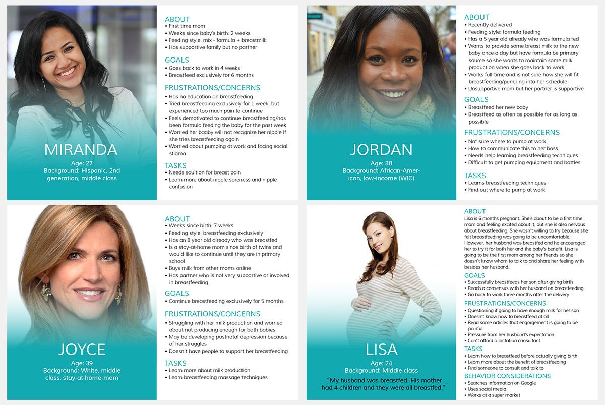
The target users for this application are pregnant and breastfeeding mothers, and their partners.
USER INTERVIEWS
Some mothers cannot afford to pay for a lactation consultant to do a home visit to provide breastfeeding support. While community centers and Women, Infant, and Children (WIC) clinics provide lactation support via peer counselors and lactation consultant to low-income mothers, many women do not have access to transportation or time to be able to come in to the clinic.
When we interviewed mothers and asked them about their breastfeeding experience, here is what they said:
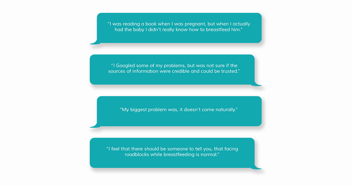
The notes from our user interviews validated what the Momkit application could be useful in real world scenarios. Momkit provides support through Pixar-style animation of breastfeeding techniques--from breast massage and hand expression to pumping and latch. MomKit content is medically validated by breastfeeding experts. MomKit helps mothers navigate the breastfeeding journey by providing evidence-based information and skills-based learning so that mothers know that “facing roadblocks while breastfeeding is normal” and they can solve many common problems with proper breastfeeding techniques.
For LGC, we worked on 2 different features of their application over the course of 4 months.
1. The Breastfeeding Dictionary feature is integrated into the application and allows mothers to learn more about their body and biology via lactation term definitions at a 6th grade reading level and animated physiology tutorials.
2. The Goal Setting Workflow needs to be developed so that LGC can answer the question: “How do mothers set goals for themselves while using the application?” An example of a goal is: “I want to breastfeed my baby for 6 months.”
Breastfeeding dictionary
This is the process we followed to design the Breastfeeding Dictionary Feature after the first round of designs:

Initial sketches
We started with sketches for the interface of the Breastfeeding Dictionary and brainstormed what features could be provided through it.
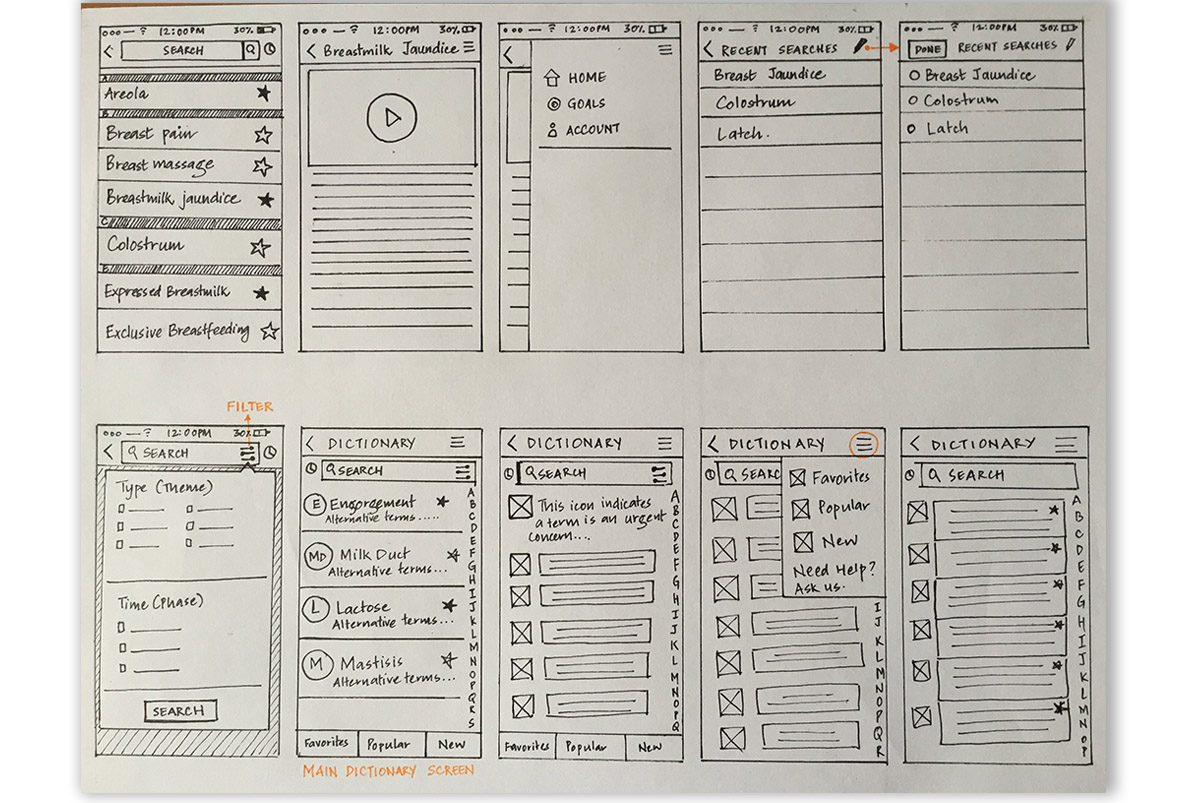
The features we thought would be useful in this scenario were:
1. A main search bar
2. Option to go back to recent searches
3. Filter feature to look at words that lie under the same theme
During our design critique session with the team, we discussed what other features could be included that would be useful in this case. We thought Favoriting a word could be an option, which could work like “Save later”. Also, we thought a popular searches tab would be useful where users could check what other users are looking for.
We also discussed the possibility of designing a feature that would allow mothers to share their problems and solutions with other mothers within the app. For example, suppose a mother found a word/massaging technique useful and thought it could be useful to her friend too, she should be able to share it through the application. Hence we decided to provide a “Share” option.
MID-FI MOCKUPS
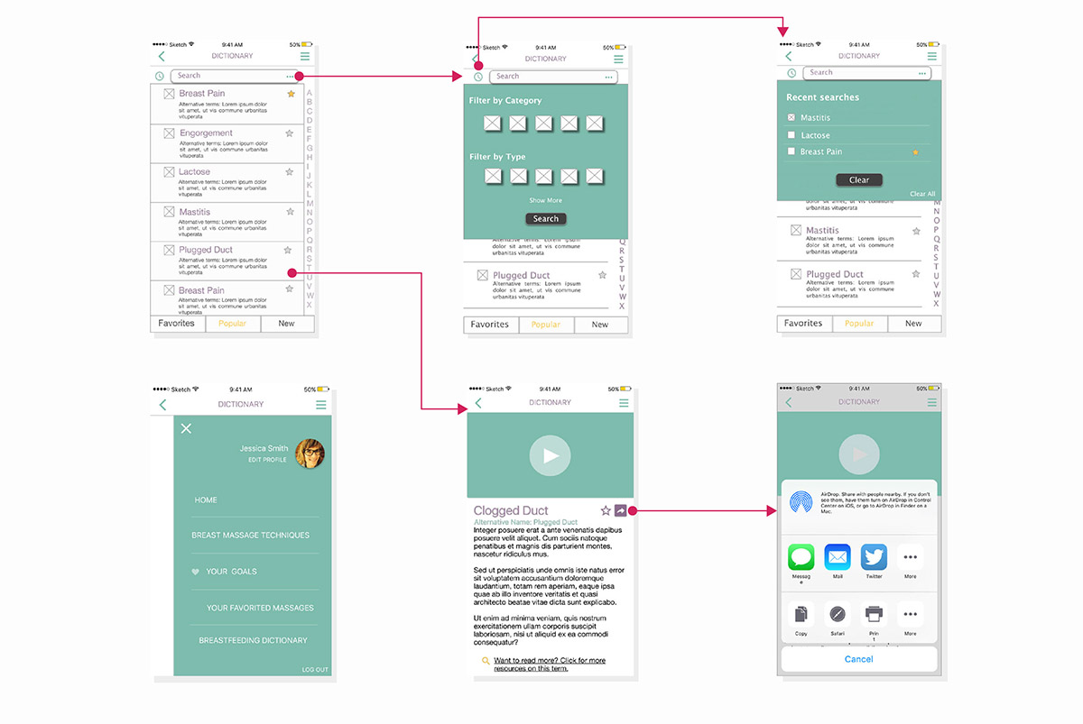
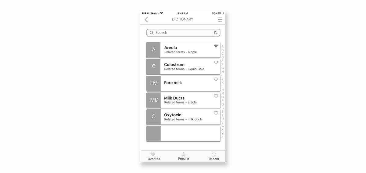
We then came up with mid-fi screens of the Breastfeeding Dictionary:
INTERACTIVE PROTOTYPE
Having come up with a concept for the Breastfeeding Dictionary, the team now decided to put it in front of users and test. We used Marvelapp to create an interactive prototype for the design and used it to test the features.
USER TESTING
Tasks:
1. Searching for a word
2. Sharing the word and related massage techniques
3. Filtering terms
4. Looking for favorited terms
Findings:
1. Filter Function:
When asked to search for all terms related to “First latch” the user did not think of filtering. Also, the filter icon wasn’t prominent enough to catch their attention.
When told about the filter function, she immediately said “the filter feature totally makes sense to me. If a mother doesn’t know what exact word to look for, but knows what the word is related to, the filter function is really useful.”
2. Share Function:
An interesting question came up in one of the user tests when we asked the user to share the word with a friend. The user asked, “What happens if I share a word/related massage technique with a friend who doesn’t have this app?”
And this is something that we brought up to the LiquidGoldConcept team to think about. Since the app is going to be purchased through hospitals and clinics and will not be available on the app store, there has to be a way for users to share information or buy the app if they don’t have it.
Recommendations:
We made 3 design recommendations for making the filter function more prominent and obvious to the user:
1. Explicitly saying “Filter” rather than putting an icon on the interface.
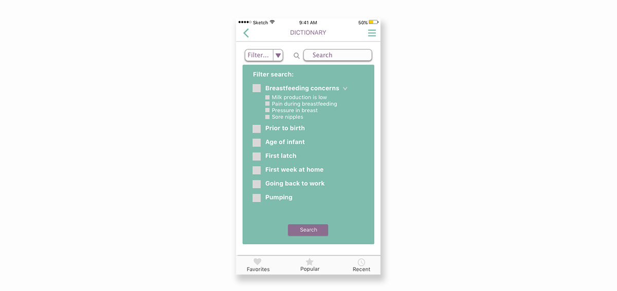
2. A drop down filter function when the user clicks on the search bar.
3. The homepage of the dictionary could have tiles of different filter themes rather than a list of words.
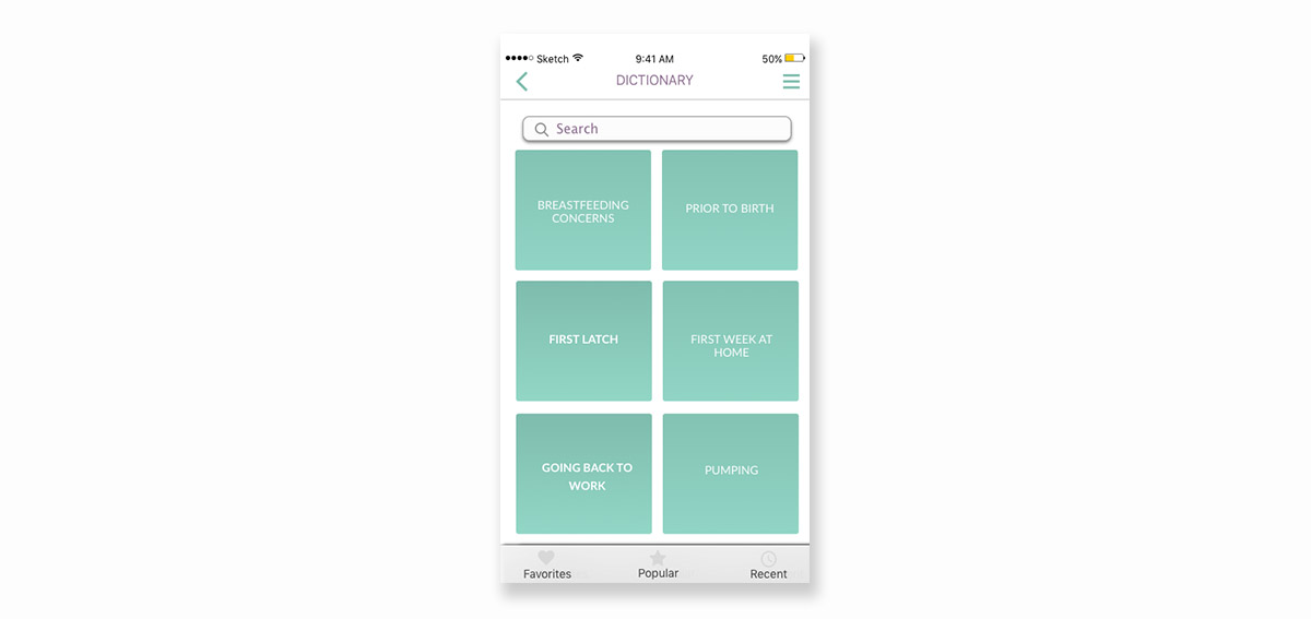
We suggested that the LGC team could use the same user testing script we used for user testing to test these designs, and make a decision as to which one is most intuitive.
Goal Framing Workflow
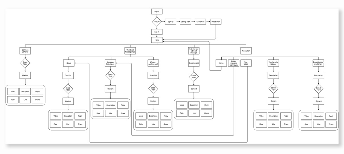
We initially laid out the the workflow of the application in a flowchart to understand the design better, since someone else had designed it.
BRAINSTORMING
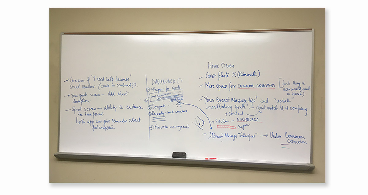
After figuring out the state of the app design, we went on to do a brainstorming session. We came up with suggestions for the user experience of setting a goal and also for new features in the workflow.
FEATURES
The features we came up with were:
1. Home Screen
A. The cover photo could be removed to make more screen space available for content on the home screen. Personalization could still be maintained by using a profile picture.
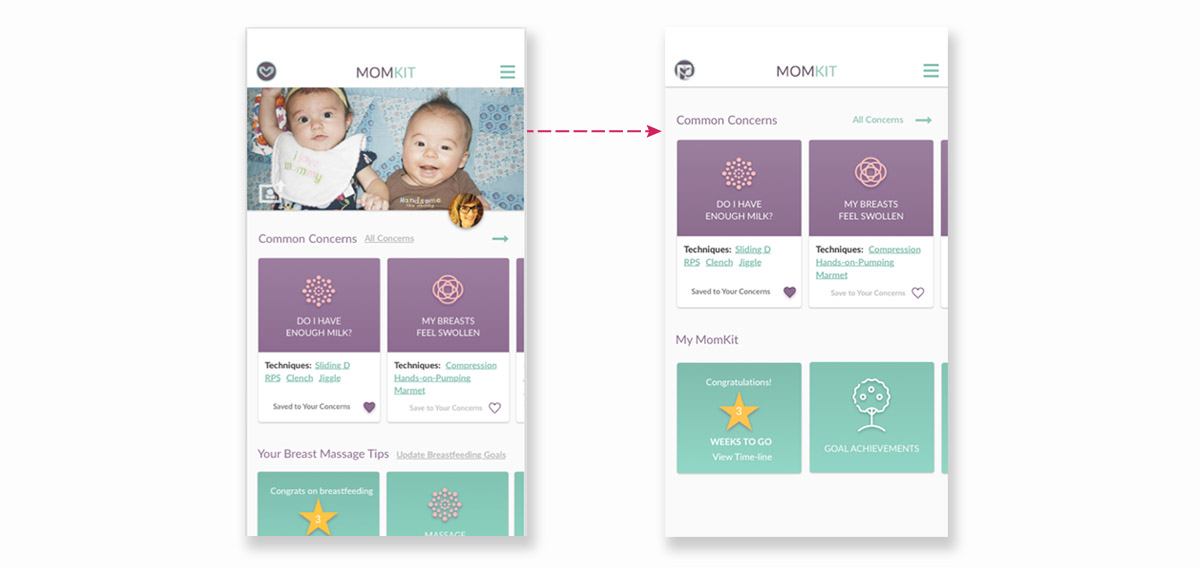
B. We could allocate more space for common concerns on the home screen since that would be the first thing a user is searching for in the app.
C. Minor UI changes to make the screen content and buttons more intuitive.
D. Added a “Dashboard” for users to see their progress on various goals on the homescreen.
2. “Concerns” and “I need help because” screens:
In the initial design, there were 2 different screens for “Concerns” during breastfeeding, and “ I need help because”. We realized these screens would have overlapping content and hence suggested to combine them.
3. Customizing a goal
On the goal screen, where the description of the goal is given, we suggested that the user should have the ability to customize some aspects of the goal, for example, the time period of the goal.
4. Minor UI changes
Such as giving short descriptions of breast massage techniques in order to avoid another click for the user to get that information.
PROTOTYPE
We created an interactive prototype of the goal framing workflow that could be used for user testing.
NEXT STEPS
We created a user testing script for the goal framing workflow, and handed it over to the LGC team so they could perform testing and validate the design.
The things we would like to test are:
1. Navigating to goal setting page
2. Adding a new goal
3. Checking how many videos the user has already watched for a goal
4. Deleting a goal
One suggestion we had for the design was to give the user the ability to add a “Personalized” goal as against a predefined goal. We included some follow up questions in the testing script to validate if adding a personalized goal is a real world scenario.